
By now you’d imagine mobile websites are commonplace, or “just work” through WordPress out-of-the-box.
Yes, there are an ample amount of mobile WordPress plugins available for site owners to choose from. Sure, there are mobile responsive themes, that, by now, have become ubiquitous. Heck, it would be a challenge to find a theme published in the last year or so not mobile friendly. However, being mobile friendly isn’t always where the bucks stops — nor should it.
Most blog and business website owners have finally become conditioned that they need mobile, because they are interacting on mobile more. Meaning, they’ve tried to lookup a business or order a product online, only to become frustrated by constant pinching and zooming on a non-mobile website. I’ve been building websites for a decade and have been shouting mobile from the rooftops for nearly 60% of it.
Let’s all agree — your WordPress website should be mobile ready.
Today we’re exploring mobile WordPress plugins for design, content publishing, and the services you need to be aware of to make sure you’re doing it all right.
The benefits of a mobile WordPress website
It’s 2016 and the benefits of mobile for our readers and business are being thrown at us from all directions. If you still don’t get it — hire a consultant.
I know that’s a harsh statement, but the fact of the matter is, I constantly hear from business owners trying to drive more leads or inbound traffic, but have become frustrated with declining numbers. Even those WITH mobile websites are finding it just as difficult.
Here’s the deal: Having a mobile friendly, WordPress website is one thing, optimizing your mobile content for improved traffic/leads, is a whole other wheel of cheese.
WordPress’ own worst enemy is the set-and-forget mentality of plugins.
Have a non-mobile WordPress theme, but don’t feel like switching? Use the Jetpack plugin to enable a mobile-friendly feel with a few clicks! Great. While that solves your mobile woes for the short-term, it doesn’t optimize the mobile experience for your brand or your online revenue.
Pro-tip: For people who want to optimize their mobile WordPress website for improving their business. If you feel that traffic, leads, and content consumption is NOT important for your business, disregard the finer points.
First, let’s get the benefits out of the way:
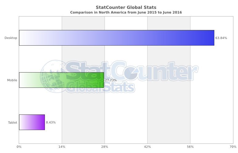
In the United States for the last year, according to this graph from StatCounter, mobile browser usage is at 27.47%. Combined with tablet traffic, that’s a third of Internet browser traffic. Important note: that’s browser, not app traffic. Let’s look at app traffic.
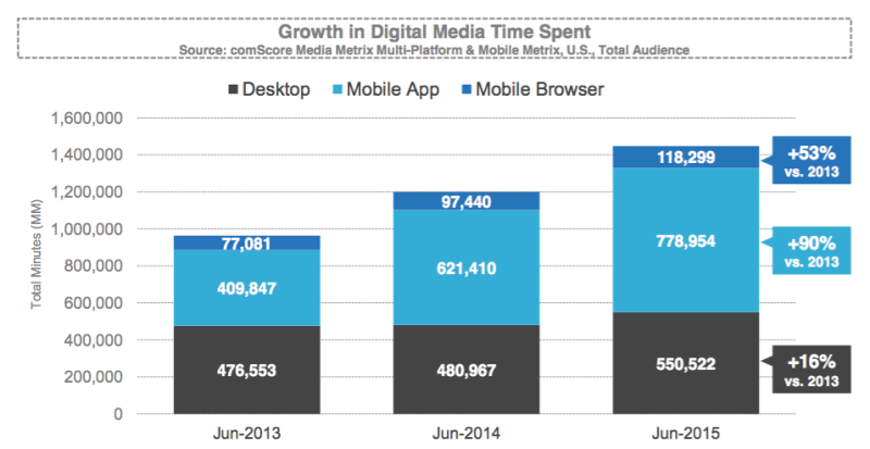
In this graph, sourced from a VentureBeat article, we see minutes spent in-app are greater than both the mobile browser and desktop browser.
Suggesting the time spent in mobile is increasing, if not leading, in some segments. Still don’t believe me? Put yourself in the data’s shoes. Take a step back and ponder how much time you spend on your phone, whizzing past product placement. From Facebook to Netflix to searching for a new place to eat — you’re there — so are your customers.
Benefit #1: Reach your mobile customers/readers
Phones are getting better than ever, and as connectivity becomes more widespread, we need to think more about mobile. If you’re reading this in July of 2016, look at the mobile phenomenon of Pokemon Go.
In just a few short years, we’ll be beyond mobile websites and into VR/AR. Crazy stuff.
Benefit #2: A new opportunity
In business, I try and flip every challenge, into an opportunity. That is to say investing in a mobile website shouldn’t be viewed as a task item or an expense line — but an opportunity for new business.
Continue to optimize for the desktop, certainly, but look to find new ways to capture an audience or lead or reader through mobile. Calling back to my “pro-tip” from earlier: it could be as simple as investing in a new theme or finely tuning the call-to-actions displayed on an iPhone 6S.
How do you know? Look at your analytics, and determine the impact on the bottom line.
Benefit #3: It’s plain good user experience
Put a smile on your readers face, or, at the very least, don’t upset them. Load your mobile pages fast and snappy. Make your content readable and enjoyable to scan. Sure this isn’t something that’s easily quantified, but over time, you’ll have a more loyal customer. Less friction means you’re doing your visitor good.
Mobile plugins for WordPress
Now we’re down to the nitty-gritty of this piece, mobile WordPress plugins and what they can do for you. If you breezed past the first half of this post, one last reminder, most plugins give their “best effort” at designing a mobile site for you. It might not look and feel like your normal desktop website, or display content exactly how you want it.
Need it pixel perfect? Go with my favorite saying: hire a professional.
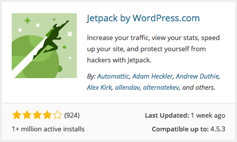
Jetpack mobile
https://jetpack.com/support/mobile-theme/
https://wordpress.org/plugins/jetpack
Pro-tip: Read my overview & getting started guide for Jetpack
Perfect for the beginner WordPress publisher. More than likely you’re using some of the other great features in the WordPress plugin and having a mobile friendly theme is icing on the cake. As you can see in the screenshots, it’s a very plain, yet modern look and feel.
Again, the theme is a best effort at creating something the general user would accept.
WPtouch & WPtouch Pro
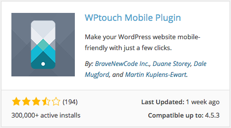
Free: https://wordpress.org/plugins/wptouch
Pro: WPtouch.com
I’ll be honest, this is the only mobile theme WordPress plugin I’ve ever worked with — and it did a fine job. For clients needing something quick and easy, the free version from the .org repo worked swell. When I needed to turn it up a notch, and customize the mobile theme a bit more, I opted for the premium version of the plugin.
More importantly, when we used this plugin on a site with LOTS of content, their CMS theme worked wonders. The premium version (depending on which license you purchase) will also get you access to their Mobile Content extension, which allows you to serve up content specifically to mobile users.
This is a handy tool for optimizing content on mobile.
Do-it-yourself with CSS Hero
Pro: CSS Hero
CSS Hero has increasingly become one of my go-to CSS edit tools for basic WordPress websites. Purists will probably cringe at the idea, but I’ve found this plugin to be lean and efficient when editing minor bits of CSS code throughout a side.
Change the font of an entire website? No problem.
Background color? Easy.
How the logo looks on a mobile device at a specified viewport? Done.
For the adventurous WordPress user, you could dive into editing your entire site for mobile ready views, using CSS Hero — though I’d probably recommend against that. It is doable, however. That said, if you had an “aging” mobile site, one that was created with iPhone 4 in mind, you could use this premium plugin to shrink and expand your margins that aren’t modernized.
I think it’s a fine tool for someone who needs to hop in and out of maintaining smallish design tweaks or has limited experience with HTML/CSS.
Mobile plugins for SEO, Content Marketing and Social media
Here’s something that’s becoming popular: super-fast, stripped down pages of your content that are linked from Google search results, Facebook, or Apple reader. The idea here is that big platforms want to speed up the page load for mobile devices, because that’s important to the user. If your business is all about publishing content, this is simply a must-have for you. No questions asked.
This segment is fairly new and there aren’t an overwhelming amount of plugin options available, so I’ll share a few I use on this website:
Facebook Instant Articles & Google AMP Pages by PageFrog
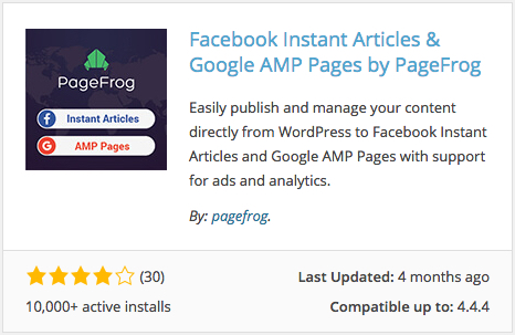
https://wordpress.org/plugins/pagefrog/
This is a mouthful of a name, but this plugin prepares your content and syncs up to the associated platform services to your WordPress website.
The FBIA and AMP formats are built to load instantly on mobile devices and designed for higher engagements, resulting in improved News Feed Ranking and greatly benefits Search Engine Optimization.
It’s no secret pages in Google rankings, especially those in the on-demand news world, are favored when supporting Google’s AMP technology. You may have seen the little AMP icon when running your own searches on current events or news.
This plugin helps you do that.
Pro-tip: At the time of this writing, this plugin receives 3.8 out of 5 stars. An “average” rating with quite a few support requests open. While I haven’t run into any issues with this plugin myself, I do recommend reviewing their support forum on .org and testing your site before launching live.
AMP by Automattic
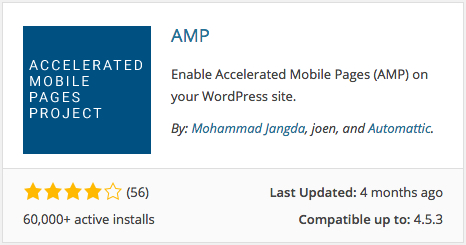
https://github.com/automattic/amp-wp
As straightforward as it gets, this plugin will enable AMP technology and is published by Automattic. No frills and no fancy options like the above plugin, but it still does the job. You also have some insurance that Automattic will continue to support and improve on it.
Optinmonster for mobile lead capture

At some point in your website’s life, you want to convert readers into e-mail subscribers. From there you have the opportunity to grow your audience deeper and potentially create a transaction to increase revenue.
Optinmonster will help you create mobile pop-ups and e-mail signup forms, without any fuss. Well, there will be fuss, like writing good headlines, and testing the look and feel of Optinmonster themes, but at least you don’t have to code the pop-up yourself.
WP Rocket for super fast mobile websites
A fast and lightweight caching plugin for WordPress. What does that mean? It can serve up pages from your webhost or server, very fast. Faster load times = better experience. Sure it’s a premium-only plugin, but well worth the money not just due to it’s speed performance, but how easy it is to configure. While there are more popular free plugins like W3TC and WP Super Cache, neither offer the common sense setup routine WP Rocket achieves.
Mobile analytics and website health
Now that I’ve thrown the stats at you for investing in a mobile WordPress website and shown you the tools for design and marketing — it’s time to measure.
Without analytics, we might not know what pages on our site are the most popular or take the longest to load. Remember, speed matters and knowing where your visitors are experiencing hiccups is valuable.
Google Search Console
Formerly known and still accessible as Webmaster tools, the Search Console is for all things “healthy.” This is the place you want to go to index your site with Google, check on incoming links, and test your mobile friendliness.
Since releasing Google AMP, you can also check to see if you have any AMP related issues here, at the same time seeing how much of your website is indexed in the search engine.
Google Analytics

First thing you want to do is check on the mobile usage coming to your website. You can view by device, browser time and even drill it down to which pages they visit. Google Analytics is par for the course at this point and a must-have for anyone who cares about where they rank and the traffic coming to their website.
Google analytics inside WordPress
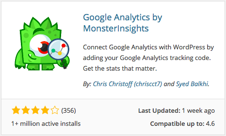
https://wordpress.org/plugins/google-analytics-for-wordpress/
Looking for an easy way to install Google Analytics to your website or don’t want the hassle of logging in and out of yet another website, checkout the MonsterInsights plugin. Once maintained by Yoast, this plugin was recently taken over by the same team behind OptinMonster.
With a few clicks of a button you can enable analytics reporting right in your dashboard and have more control over what you want tracked through Google.
Crazyegg
Another one of my favorite tools for heatmap tracking for my WordPress websites. Crazyegg makes it drop-dead-simple for us to track where users scroll and click on any page we’re tracking with their service.
You can break out the reports to drill down to mobile versus desktop, so you can pinpoint exactly how your visitors are using your site on any device. It’s a premium service starting at $9 a month.
Conclusion: Mobile experience for beginners and experts
I’ve heard folks in our industry mention “WordPress isn’t responsive.”
Unfortunately, that’s due to being misinformed, but also a reminder for those of us involved in the WordPress community every day. We need to do a better job educating around what mobile means, at every level. While a majority of themes are responsive, and plugins enable new mobile interfaces, that’s just a piece of the puzzle.
You have to ask yourself:
- Does my site get a lot of mobile traffic?
- How important is mobile to my business?
- Does the look and feel of mobile need to vary from device to device?
- Do I have a lot of content needing to be optimized?
- What opportunities does my business have for mobile?
Answers will range, so make your mobile decisions wisely. Just starting out? Jetpack might do the trick. Growing your e-mail list from 5,000 to 50,000 — it’s time to use a mobile capture solution.
At the end of the day WordPress is a great platform for mobile websites and even apps. But that’s another story. 🙂