Editor’s note: The Baton theme is created by my company, Slocum Themes. The following tutorial aims to get you started using our new theme, and understand why we made the choices in features.
After 7 long months in the WordPress theme review queue, our recent theme Baton has been pushed live.
Baton (free) and Baton Pro have been a labor of love for nearly a year, dating back to the summer of 2015. At Slocum Themes, we’re not your typical theme shop, most of our time is focused on traditional WordPress development and consulting, then reinvesting that time into digital products. While under development, Baton immediately became the go-to theme for a majority of client projects:
In today’s tutorial, I’ll describe why we created the theme, how it helps us launch client websites faster, and scratches the multipurpose itch.
Baton; a multipurpose theme
Baton theme preview video 20:52 | Subscribe to PluginTut on Youtube
Want my honest opinion? I loathe the word multipurpose when it comes to WordPress themes. Why? Because so many themes use that phrase out of context and position their multipurpose theme as an all-purpose theme.
As the creator and owner of this theme, I have no issues with telling you that this theme is not for every project. Yes, it’s multipurpose and could serve well for verticals like:
- Modern blog
- Modern business
- Software companies
- Non-profit organizations
- e-commerce
- Digital product and membership sites
However, I don’t think it’s for magazine-type sites or news-type sites. In fact, that’s why I didn’t use it for this website. Sure, with the power of Conductor, Baton can do a whole heck of a lot, but there’s still (in my professional opinion) a theme look & feel limitation. All of that said, if the theme’s design cater to your brand or mission — it’s going to knock it out of the park for you.
Drag and drop the WordPress way
Baton theme drag and drop homepage 11:22 | Subscribe to PluginTut on Youtube
That’s a loaded statement, so let me explain:
First, Baton is an opinionated theme. There’s an arsenal of super-popular themes on WordPress.org and on Themeforest, that throw everything into the options panel. Every. Single. Option. Ever.
Hey, that’s great for the customer!
Yes, until they are drowning in too many options — which is a thing, by the way — leading to paralysis by analysis, making a majority of available options, useless. The user doesn’t know where to begin and probably needs to be a developer regardless, so they know how to properly adjust padding and margin.
Second, just like with our Conductor plugin, we do not want to create a new “customizer” for our user experience. For better or for worse, we want to use what WordPress gives us. There’s three reasons for this:
- We don’t want to invest in the overhead of developing a new “layer” on top of WordPress.
- We feel the customizer is still young and will continue to see improvements from a team much larger than our own.
- If a customer decides to switch themes, they don’t have to re-learn “WordPress.” In our humble opinion, creating a new experience that takes over the WordPress customizer is short-sighted and ultimately fragments the adoption of WordPress.
How Baton achieves drag and drop

What does that leave us with?
It leaves us with standard WordPress widgets and sidebars. Love ’em or hate ’em, it’s what we’ve got to work with right now. Recently, WordPress released an update to customizer performance, and as a result, so did Baton + Conductor.
That’s not to say they are just basic widgets. As you’ll see in the video demonstrations, we’ve improved on the experience of the customizer, by using our Note plugin. Note was created to work in the customizer and give the user a live editing experience. We’ve taken that same technology and expanded it within the Baton theme.
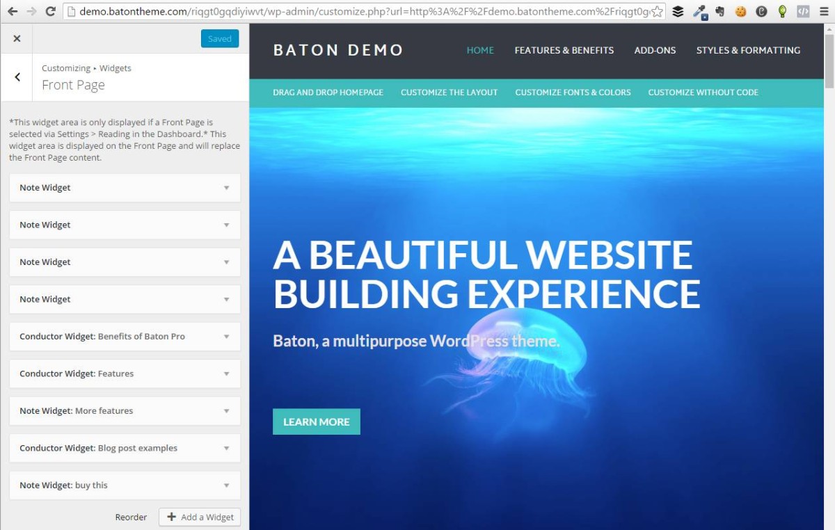
For example, setting up the homepage consists of 1 sidebar and however many Note (or Conductor) widgets you want. We then take the basic Note widget, and form unique displays, like the hero widget for engaging call to action areas. A user can use however many she would like, and drag and drop them in any particular order.
https://www.youtube.com/watch?v=JECnzu_Ofck
Baton theme features 10:26 | Subscribe to PluginTut on Youtube
Flexibility is paramount

We feel like we’ve struck a great balance between flexibility AND staying within the lines. What do I mean by that? You can customize the homepage to your heart’s content, but you still have to work with the displays we’re giving you.
Here’s one of my favorite examples:
It’s very common for today’s WordPress theme to give you a widget area to display your favorite products or features on the homepage. However, it’s typically a basic text widget with 3 or 4 text fields and an icon upload. Which is great, until you don’t have 4 features, or you have 12 features that you want to display. Now what? Your left with blank space or no way to expand it.
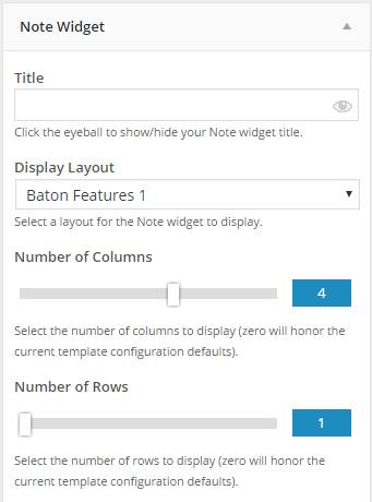
That’s where our Note Features 1 display comes in: You can assign up to 6 columns and 10 rows and the styles remain intact. There’s no need to adjust CSS or spacing or anything of the sort.
Got 3 features? No problem. 30? Piece of cake.
Installing the Baton theme
https://www.youtube.com/watch?v=8reugxU5vps
Installing the Baton theme 2:09 | Subscribe to PluginTut on Youtube
Not many people get excited about installing a WordPress theme — but I do.
Here’s why: providing a demo through WordPress.org ‘preview’ button is no easy task. Well, unless we’re shipping stored content in the theme, which falls under the “hit-or-miss” theme review approval column. We tried that and got rejected. Thankfully, that lead us to design a new way to display the theme via a default look and feel with the content that you already have in your website. You can toggle this on or off in the customizer with ease.
At the end of the day, it takes 2 short minutes to install and activate. Give or take.
Using the Baton theme

At the end of the day, you simply need to try it for yourself. It’s free AND fun.
Baton’s flexibility helped us design and launch client sites faster, giving them greater control over the display of their content. We could sleep well at night, knowing that they didn’t have the power to totally destroy their site — it was a win-win.
You can even spin up a working demo of Baton Pro, which comes with more features for color choices, fonts, and bundled with Conductor core.
Downsides of Baton Free
Am I really the creator of a product naming it’s downsides? Yes. Transparency is key.
- Baton free doesn’t have a boat-load of options. We feel it’s just enough to get started with your new WordPress website.
- We haven’t built-in complete support for WooCommerce yet. It’s on our radar.
- It’s multipurpose, but not all-purpose (read above for the difference)
- We realize the design isn’t for everyone and that’s okay.
- Font styles are limited in free. We’re thinking of allowing more in a later update.
Again, it’s free and you can spin up a demo of the Pro version to see the differences. If you have questions, feel free to reach out to us or comment below!

